> ## Documentation Index
> Fetch the complete documentation index at: https://osbelgrade.mintlify.site/llms.txt
> Use this file to discover all available pages before exploring further.
# Branding
> Design principle: Every visual choice is also a conceptual choice. Nothing decorates. Everything documents.
 ## The Contemporary Approach
OS:B's visual identity doesn't follow traditional "poetry collection" aesthetics because this isn't a traditional poetry collection. The branding reflects the core concept: treating cultural experience as a technical system that can be documented, debugged, and understood.
## The Contemporary Approach
OS:B's visual identity doesn't follow traditional "poetry collection" aesthetics because this isn't a traditional poetry collection. The branding reflects the core concept: treating cultural experience as a technical system that can be documented, debugged, and understood.
 ## The Color System
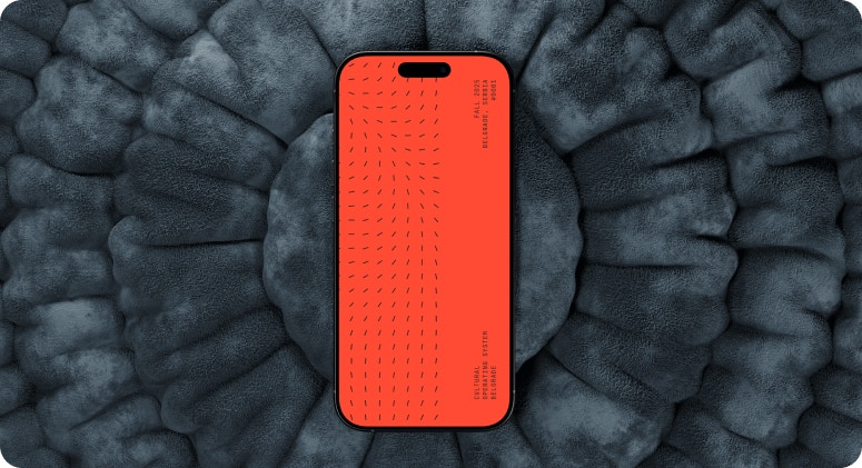
**Primary: #ff4b33 (Red/Orange)**
This isn't purely decorative - it's functional. The red serves as:
* **The path through chaos** - A visual thread guiding you through complexity
* **Data highlighting** - What matters in the noise
* **System alerts** - Attention, observation, activation
* **Belgrade itself** - Bold, unapologetic, impossible to ignore
Contemporary branding uses color as information architecture, not just decoration. The orange doesn't prettify - it orients.
**Secondary: Black**
Pure contrast. No grey area. Binary. On/off. Observed/unobserved.
## The Color System
**Primary: #ff4b33 (Red/Orange)**
This isn't purely decorative - it's functional. The red serves as:
* **The path through chaos** - A visual thread guiding you through complexity
* **Data highlighting** - What matters in the noise
* **System alerts** - Attention, observation, activation
* **Belgrade itself** - Bold, unapologetic, impossible to ignore
Contemporary branding uses color as information architecture, not just decoration. The orange doesn't prettify - it orients.
**Secondary: Black**
Pure contrast. No grey area. Binary. On/off. Observed/unobserved.
 ## The Pattern Systems
### Arrows
Directional data flow. System processes. Movement through Belgrade's chaos.
Most arrows are black (the city's movement), but the orange arrows trace **my path** - the user's navigation through illegibility. It's a visual representation of finding direction when you can't read the signs.
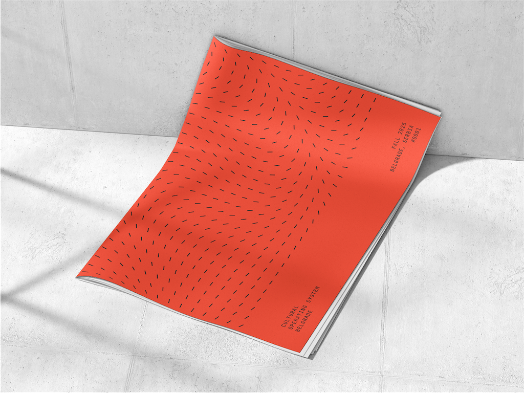
### Rotating Dashes
Observations accumulating. Rain falling. Data points.
The pattern transforms from vertical to horizontal with a **transition zone** - the moment of change, the pivot point, the corner where everything shifts (like the Waterworld poem).
These aren't decorative elements.
They're **data visualisations** of the learning process itself.
## The Pattern Systems
### Arrows
Directional data flow. System processes. Movement through Belgrade's chaos.
Most arrows are black (the city's movement), but the orange arrows trace **my path** - the user's navigation through illegibility. It's a visual representation of finding direction when you can't read the signs.
### Rotating Dashes
Observations accumulating. Rain falling. Data points.
The pattern transforms from vertical to horizontal with a **transition zone** - the moment of change, the pivot point, the corner where everything shifts (like the Waterworld poem).
These aren't decorative elements.
They're **data visualisations** of the learning process itself.
 ## The Icon System
**FontAwesome** is an open-source icon library providing scalable vector icons designed for web interfaces, developer tools, and technical documentation. The iconography is standardised, systematic, and ubiquitous in software development environments - instantly recognisable as belonging to digital/technical contexts.
For OS:B, FontAwesome icons reinforce the **technical documentation aesthetic** throughout both the Mintlify site and physical publication. Icons function as visual shorthand for system operations: location pins for coordinates, calendar icons for timestamps, code brackets for module categories, warning triangles for System Errors etc.
Using FontAwesome maintains **visual consistency** with developer tools and platforms while providing a **functional design language** that mirrors the project's approach - treating cultural observation as systematic documentation. The icons don't decorate; they **classify and organise**, operating as visual metadata that helps readers navigate the observation logs. FontAwesome's vector format ensures scalability across digital and print outputs, and its technical origins align perfectly with the subversion of developer tools for poetic purposes.
### Featured Navigation EIcons
### Chapters
Original Textual Content Repository Icons
### Codex
Extended Functionality Icons
### System
System Reference & Sharing Icons
### Admin
System Administration Icons
## The Textures
**Concrete + Digital**
Raw Belgrade (concrete, urban decay, socialist architecture) meets clean technical documentation (crisp typography, systematic layouts, code formatting).
This contrast **is** the experience - ancient city, modern tools; illegible streets, systematic observation.
Contemporary branding embraces these tensions rather than resolving them.
## The Typographic Philosophy
**Minimal. Technical. Precise.**
* Small identifiers (OS:B)
* System summaries (module names, timestamps)
* No flourishes
* Information hierarchy through size and weight, not decoration
The type doesn't perform.
It documents.
## The Icon System
**FontAwesome** is an open-source icon library providing scalable vector icons designed for web interfaces, developer tools, and technical documentation. The iconography is standardised, systematic, and ubiquitous in software development environments - instantly recognisable as belonging to digital/technical contexts.
For OS:B, FontAwesome icons reinforce the **technical documentation aesthetic** throughout both the Mintlify site and physical publication. Icons function as visual shorthand for system operations: location pins for coordinates, calendar icons for timestamps, code brackets for module categories, warning triangles for System Errors etc.
Using FontAwesome maintains **visual consistency** with developer tools and platforms while providing a **functional design language** that mirrors the project's approach - treating cultural observation as systematic documentation. The icons don't decorate; they **classify and organise**, operating as visual metadata that helps readers navigate the observation logs. FontAwesome's vector format ensures scalability across digital and print outputs, and its technical origins align perfectly with the subversion of developer tools for poetic purposes.
### Featured Navigation EIcons
### Chapters
Original Textual Content Repository Icons
### Codex
Extended Functionality Icons
### System
System Reference & Sharing Icons
### Admin
System Administration Icons
## The Textures
**Concrete + Digital**
Raw Belgrade (concrete, urban decay, socialist architecture) meets clean technical documentation (crisp typography, systematic layouts, code formatting).
This contrast **is** the experience - ancient city, modern tools; illegible streets, systematic observation.
Contemporary branding embraces these tensions rather than resolving them.
## The Typographic Philosophy
**Minimal. Technical. Precise.**
* Small identifiers (OS:B)
* System summaries (module names, timestamps)
* No flourishes
* Information hierarchy through size and weight, not decoration
The type doesn't perform.
It documents.
 ## The Meta-Approach
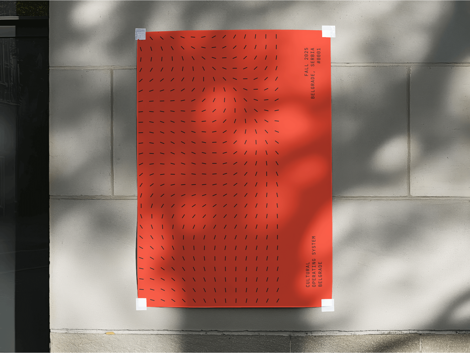
This branding **performs its own concept**.
Just as the poems are formatted as Python code, the visual identity uses technical/systems thinking:
* Patterns = `data`
* Color = `navigation`
* Layout = `structure`
* Design = `documentation`
It's not "poetry packaging."
It's a **visual operating system** for cultural observation.
## Why This Works Now
Contemporary audiences expect:
* **Honesty over polish** - Raw observation > curated perfection
* **Systems thinking** - Understanding how things work, not just what they look like
* **Multi-platform coherence** - Same logic works physically (publication) and digitally (Mintlify)
* **Conceptual integration** - Form follows (and reinforces) content
The branding doesn't ask you to appreciate poetry.
It asks you to **debug a city**.
## The Meta-Approach
This branding **performs its own concept**.
Just as the poems are formatted as Python code, the visual identity uses technical/systems thinking:
* Patterns = `data`
* Color = `navigation`
* Layout = `structure`
* Design = `documentation`
It's not "poetry packaging."
It's a **visual operating system** for cultural observation.
## Why This Works Now
Contemporary audiences expect:
* **Honesty over polish** - Raw observation > curated perfection
* **Systems thinking** - Understanding how things work, not just what they look like
* **Multi-platform coherence** - Same logic works physically (publication) and digitally (Mintlify)
* **Conceptual integration** - Form follows (and reinforces) content
The branding doesn't ask you to appreciate poetry.
It asks you to **debug a city**.
 ***
***